Colour Is the New Conversion Tool, How REALTORS® Win Attention and Trust in 2026.
We love COLOUR, welcome Marty Supreme.
Colour is the new branding tactic, and most brands within the Real Estate sector are missing the shift. Over the years, branding and storytelling, often highly personal, have caused professional messages to become diluted and lost amid irrelevant noise. REALTORS® often speak to other REALTORS® on-line rather than to the consumer. Perhaps that too has had impact on trust, relationships and growth. How do we move into 2026 with a clear brand representation of our role in Real Estate? How can we catch the attention of our target audience and keep it to convert?
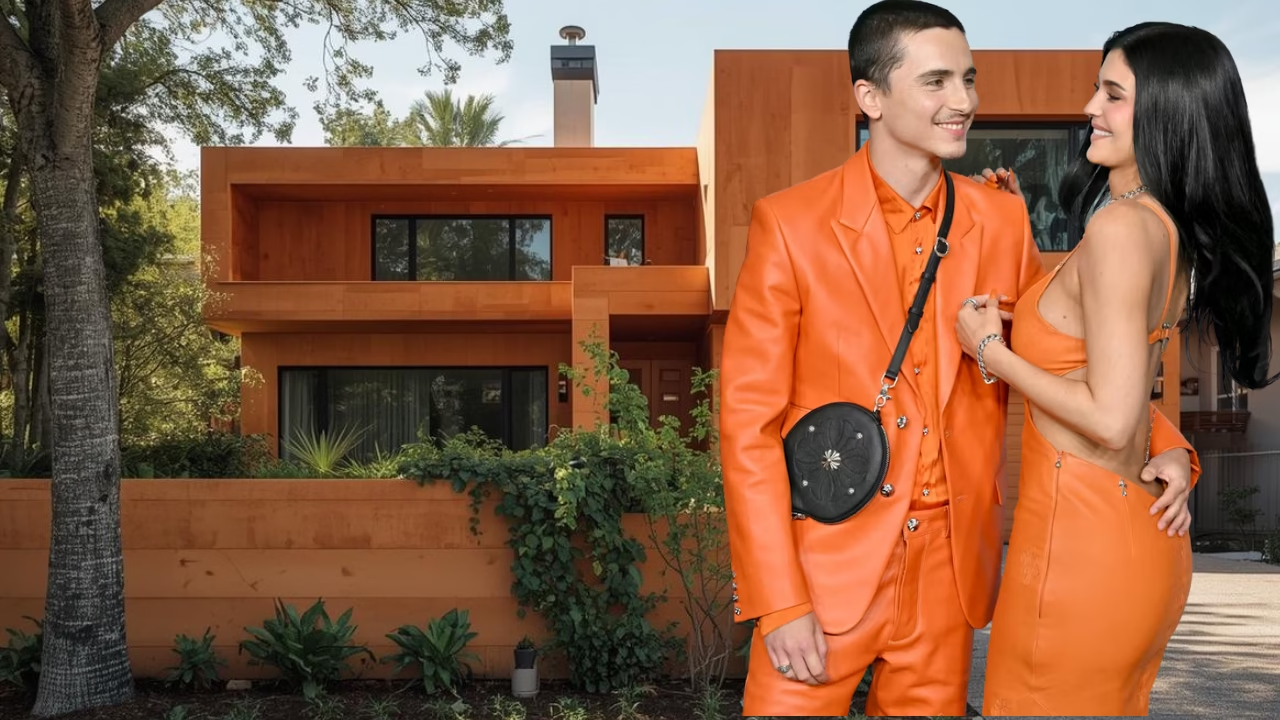
This month, Timothée Chalamet and world’s fashion & makeup moguel & muse, Kylie Kardashian, sparked a cultural moment by doing something deceptively simple, they made colour the message. By transforming once-boring beige and introducing bold orange into their visual universe, they created one of the most talked-about campaigns of the year, without relying on traditional advertising. No heavy media buys. No noise. Just unmistakable colour, used with intention…just by walking into rooms, they were spotted.
Real estate is no different. In fact, it may be the industry that needs this shift the most.
For decades, REALTORS® have been told that consumers need to experience 12 touchpoints before they consider reaching out. Repetition, consistent messaging and connecting have been the primary rules. Postcards, emails, social media, signs, ads phone calls, more, more, more. Perhaps that is why it is so noisy out there in the Social Sphere. But in an oversaturated market, frequency alone no longer guarantees attention. The modern consumer isn’t overwhelmed by a lack of information, they’re overwhelmed by sameness. Everyone is looking like an animated Chat GPT Wall.
This is where colour changes everything.
In 2026, attention is earned visually before it is earned intellectually. Colour creates instant recognition. It bypasses logic and speaks directly to emotion and memory. When a brand consistently shows up in a distinct colour palette, the consumer begins to recognize it without effort. No headline required. No explanation needed. Just familiarity, and familiarity breeds trust. Branding is trust.
For REALTORS®, standing out in a crowded market is no longer about louder messaging or trend-chasing design. It’s about building a visual identity that feels intentional, confident, and unmistakably yours. Colour becomes the shortcut.
The most successful agents are no longer branding services, they are branding experiences. And every experience has a feeling attached to it. Colour is what carries that feeling across every consumer touchpoint. From listing presentations to signage, social content to email headers, open house materials to digital ads, colour acts as the connective thread that tells the consumer, ‘ You’re in the right place. ‘
I’m not sure I have ever been tired of beige. This is why neutral branding is quietly losing ground. While beige, grey, and muted tones once signalled professionalism, today they often disappear into the background. In a sea of sameness, safe becomes invisible. Colour, when used with intention, signals leadership, clarity, and confidence. It says, ‘ I know who I am, and so does my brand. ‘ And most importantly so do loyal clients.
Importantly, this doesn’t mean REALTORS® need to be loud or flashy. Standing out isn’t about neon or novelty. It’s about alignment. The right colour reinforces the energy you want clients to feel when working with you, calm, empowered, elevated, trusted, inspired. When that colour shows up consistently, it becomes a mental anchor. The consumer may not remember every message you’ve sent, but they will remember how your brand made them feel. Inspire people.
This is where conversion happens.
When a potential client sees your colour repeatedly, on their screen, in their neighbourhood, in their inbox, it creates a sense of familiarity long before the first conversation. By the time they reach out, you already feel known. The relationship has already begun. That is the quiet power of colour-led branding.
In 2026, the most effective REALTORS® will build colour into their entire brand universe. Not as decoration, but as strategy. Colour will guide how they show up online, how their listings are perceived, how their marketing feels, and how clients emotionally experience the process of buying or selling a home.
Consumers don’t just choose agents based on competence. They choose based on resonance. Colour accelerates that connection.
The future of real estate branding isn’t about adding more touchpoints, it’s about making each one unmistakable. Colour turns repetition into recognition. It transforms presence into preference. And in a crowded market, preference is everything. Is anyone tired of ‘ more ‘ ? Hit them once and fuel that connection through relationship branding.
The shift is here. The question for REALTORS® in 2026 is simple, will your brand blend in, or will it be remembered?
Virginia Munden